Overview —
Simple reports aims to provide teachers with straightforward and simple assessment metrics.
The objective of this project was to bring basic reporting capabilities that conveyed student and class performance to teachers.
In this project, I utilized customer input and previous research insights to design two different type of reports, determined visualisations to be used based off available data, made cost reducing compromises, and actively collaborated with developers to understand the capabilities of the chosen javascript library and ensure correct implementation.
Exploration —
Customer input and past research
Customers and prospects previously requested different variations of reports. This information was captured by the Sales team and was used to identify needs and expectations surrounding reporting capabilities.
Findings from previous research were also used to inform the presentation of test data. Teachers needs surrounding test report data was uncovered in a previous and unrelated research study. These findings were essential in deciding what data to display and how to display it. Below three key findings are illustrated:
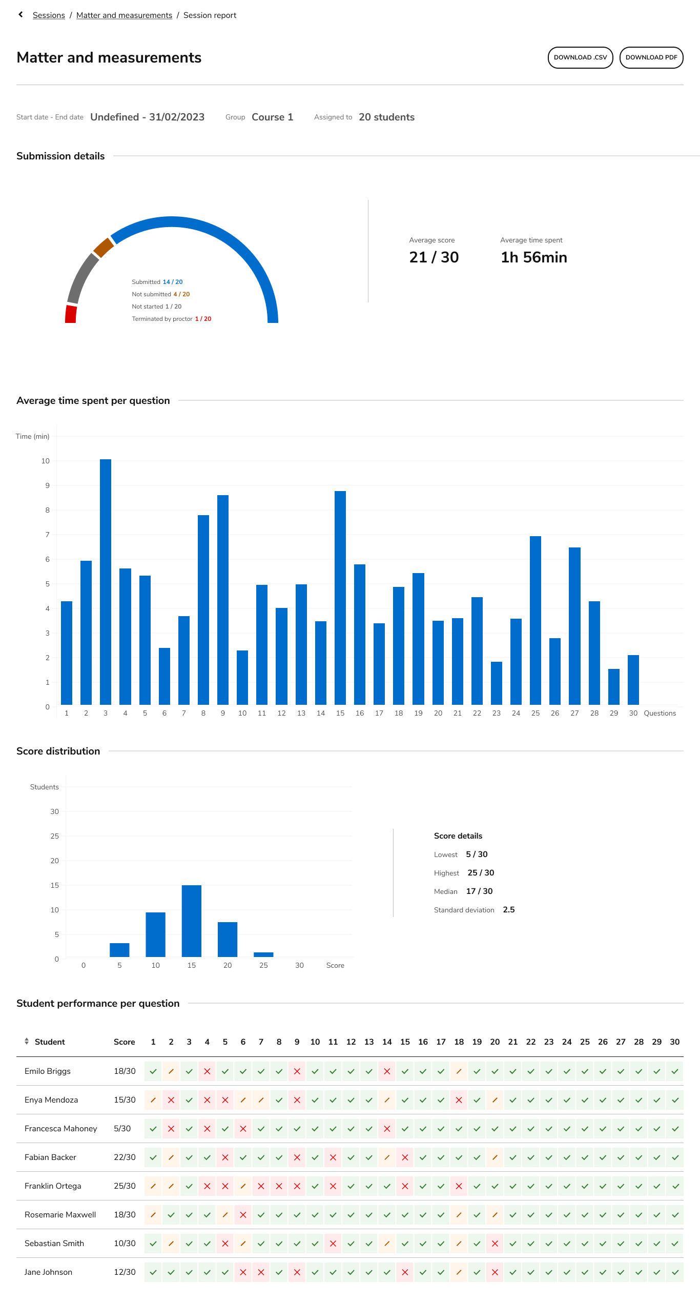
Test status
Teachers want a quick idea on how the session went and which questions test takers understood and which questions caused difficulties.
Comparison
Teachers desire to compare results amongst test takers and questions to better understand performance.
Test identification
Teachers desire to look at assessment data for a given session. This can be at the group level, such as a classroom, or at the test taker level.
Competitor analysis
A competitor analysis was conducted to identify strengths and weaknesses, identify common methods of conveying particular information, and discover how competitors solve particular usability issues. This analysis allowed me to understand what competitors are doing well and where they may be falling short, which helped to shape the approach and strategy.
The key takeaways from this analysis were:
Use of color
Color was consistently used to convey information. While this can often aid in understanding, it raises accessibility concerns.
Visualizations
Bar graphs and heat maps were amongst the most common. This could be because of the level of comfort with making conclusions from them.
Accessibility
Some competitors addressed accessibility and others did not. To provide equal access, it was important that our reports were accessible.
Text size
The primary score is often large and front and center in the report. Other text is a smaller size and serves to support visualizations not provide explanations.
Access
Iterating and trade offs
The data collected above was used to inform and design wireframes first in Balsamic and then Figma. This work underwent multiple iterations with the intent of simplifying the scope in order to reduce the cost. Limiting the scope included using a javascript visualisation library instead of building each chart as component, reducing the amount of interactivity on the charts (for now), and choosing charts carefully. These trade offs resulted in less resources being required from the team and allowed us to implement reports quicker and at a lower cost.
Initial Balsamiq wireframes

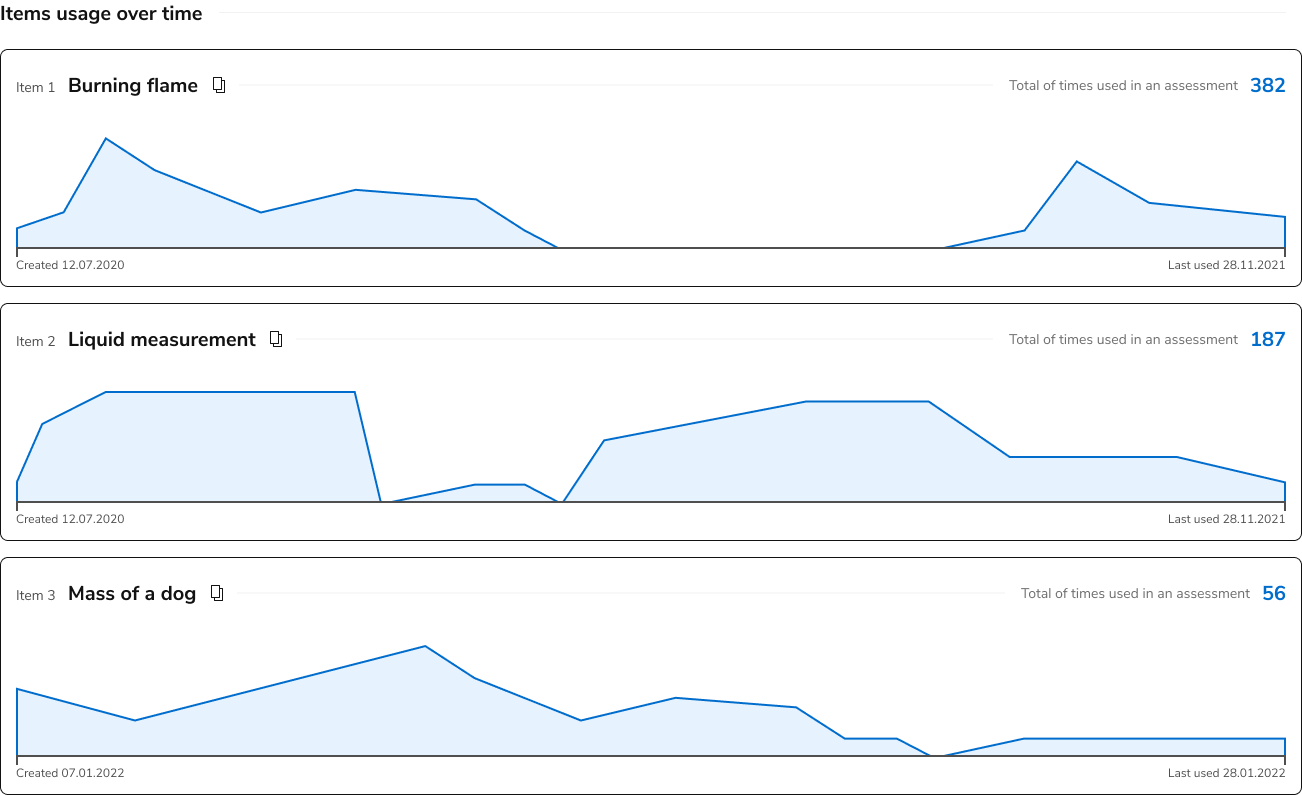
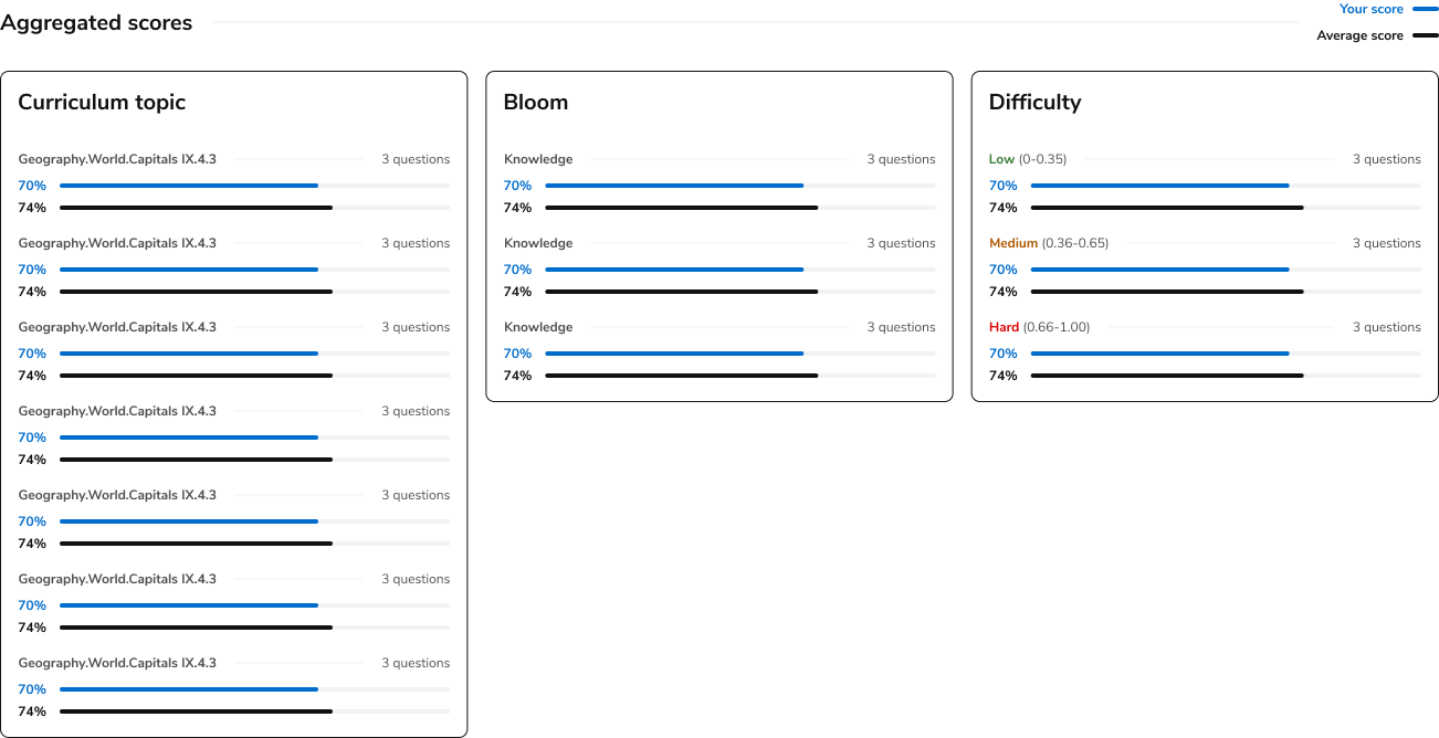
Initial Figma wireframes and alternative charts that were not used due to complexity.
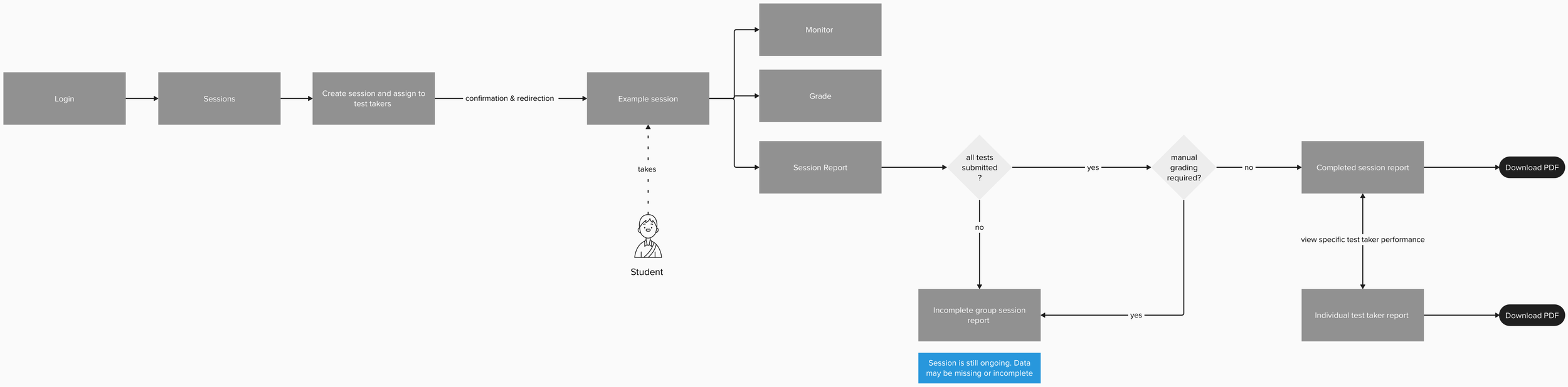
Implementation —
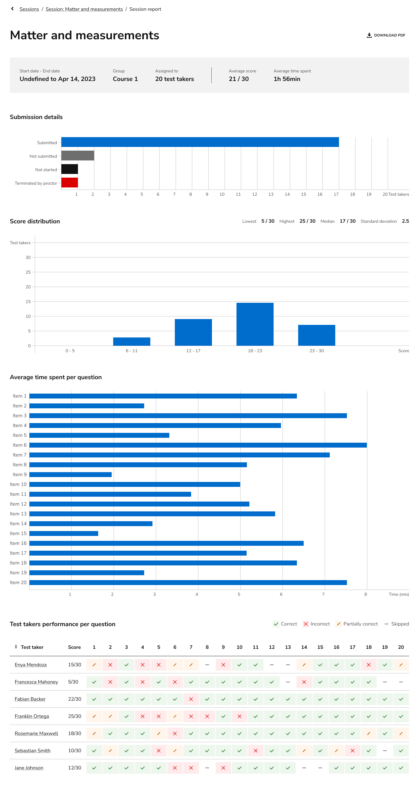
Group session report
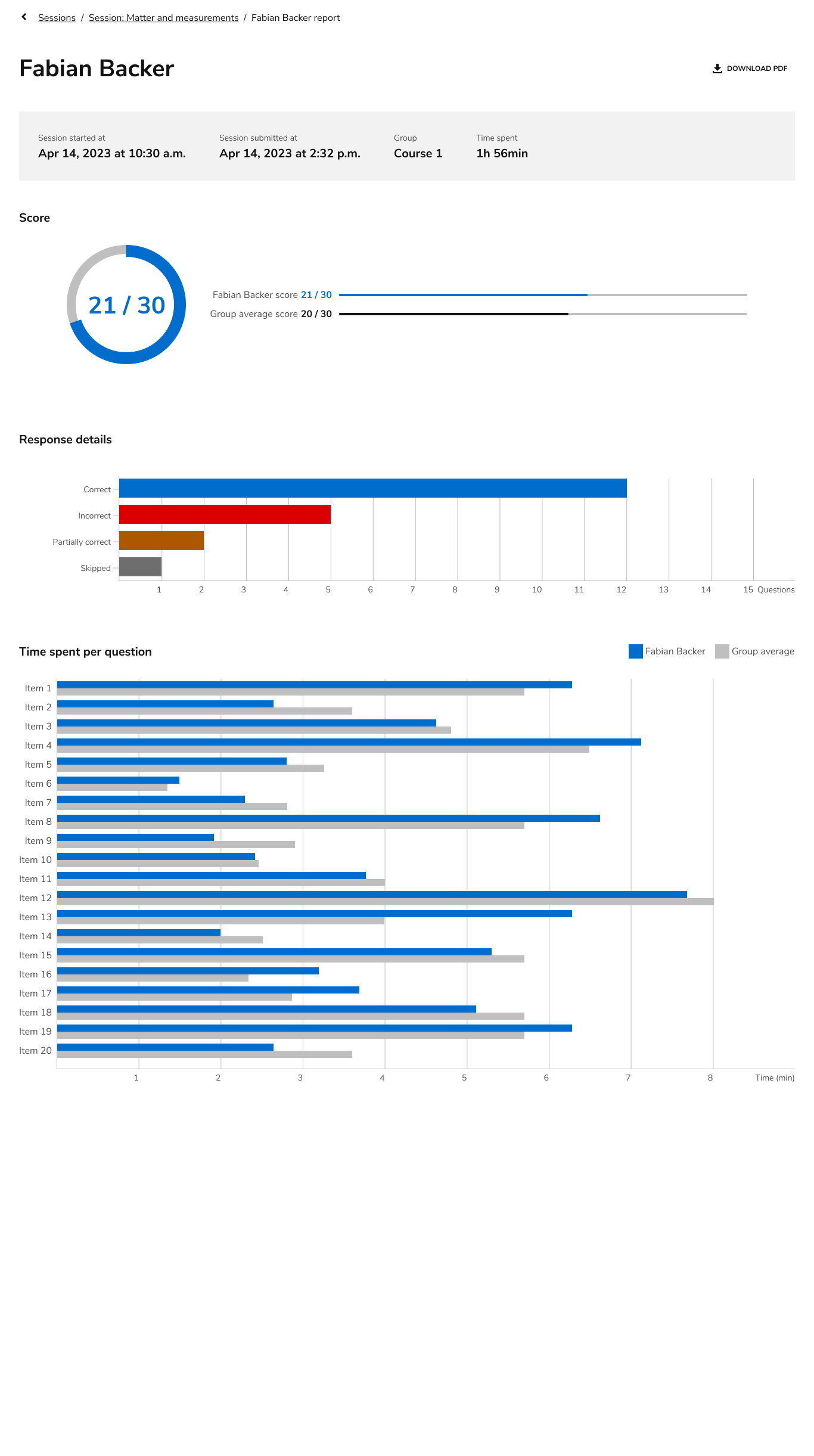
Individual test taker report
Summary —
My role
In this project, I utilized previous research insights to design a group test report , chose the visualisations to be used, made cost reducing compromises and collaborated with developers to understand the capabilities of the chosen javascript library.
My impact
My work contributed to a company quarter goal to provide basic reporting to our SaaS customers. Prior to this, data was only available in a CSV format and had to be analyzed and interpreted. This work allowed Teachers to have a simple and straightforward way of accessing data.
Next steps
Address trade offs that had to be made.
Provide customers with more custom and advanced reports.